

Data Vis & Layout
Book Jacket-The Secrets of Snicket

This project is a book jacket created for a spin off novel of the A Series of Unfortunate Events novel series. Because the original novels were targeted at teens and young adults, this book jacket was designed with the same target audience in mind. This design was created to nod to the original books by recreating the style and dark feel. This can be seen through my use of shape and color pallet. I also selected typefaces that resembled the original novel.
Creating this ready for print book jacket requires skills in understanding print specifications and alignment considerations. It was also important to make sure the final dimensions were exact, so the jacket would fit and align correctly after being printed and cut.
Digital Ticket- Horizon Railways
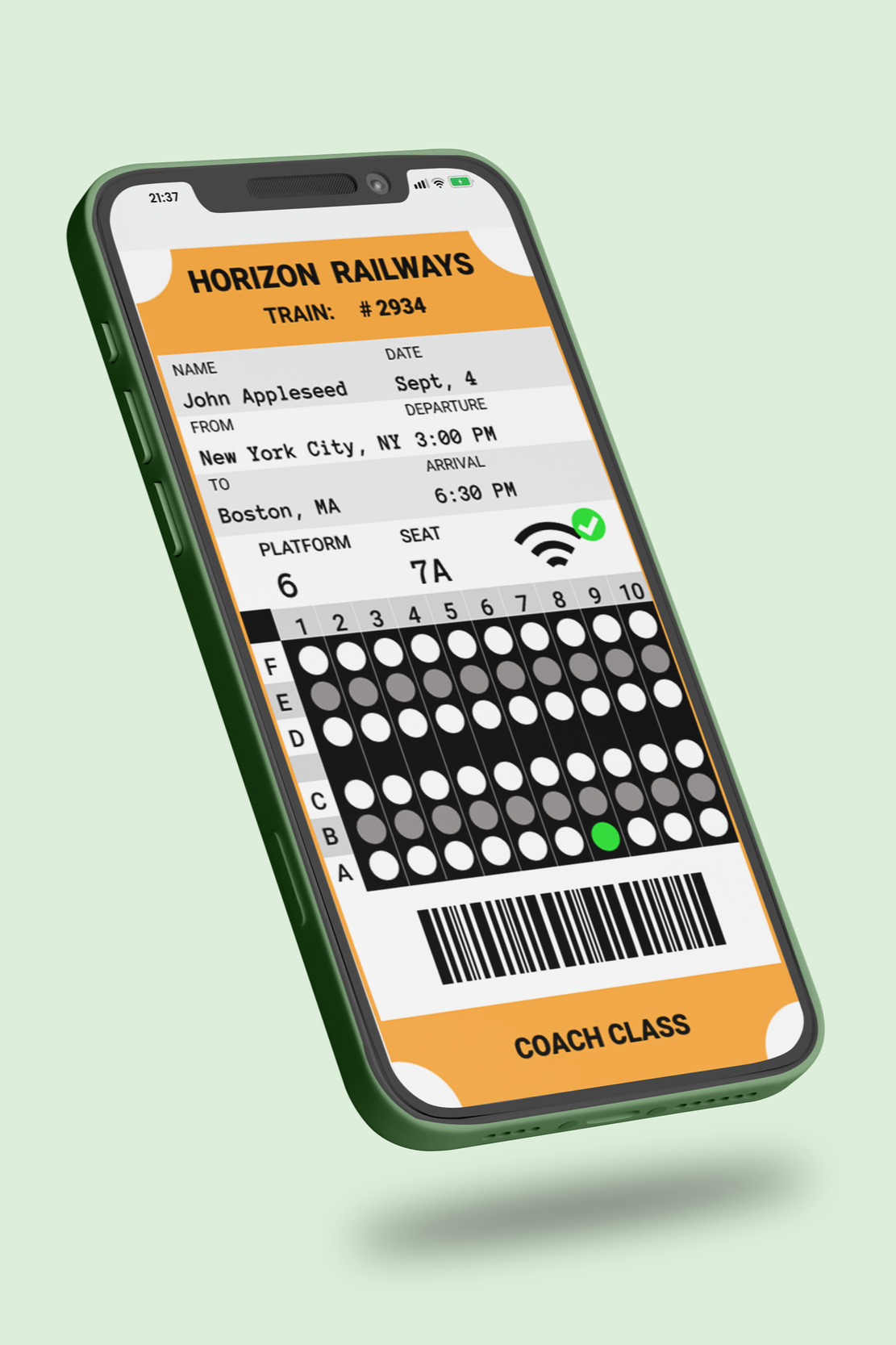
This artifact is a digital train ticket design created for Horizon Railways. The purpose of this design was to create a digital ticket that made it easy for the customer to find their seat and also inform them of free Wi-Fi available on the trains. The target audience for this design was a younger demographic that currently used the railways mobile app.
The overall concept of this design was ease of use and readability. Focusing on the user experience, or how pleasant and easy a design is to use, was crucial in this design’s conception. There was a lot of information to include in a small area so, optimizing the space was key. Making sure the design was readable by carefully selecting a typeface and ensuring high contrast was extremely important. The design needed to be easily interpreted by the user on the go, so the design was kept simple and efficient.
Brochure-Piddle Paddle Boat Tours


This print-ready brochure was created for a boat tour company called Piddle Paddle Boat Tours. There is a great deal of information included in this project, so keeping things organized was extremely important. The visual hierarchy I have created guides the viewer through the brochure and helps them locate the information they need. This was accomplished through my typography choices, use of icons, and image application.
Another key factor in this design was alignment. Creating a trifold brochure can be a bit complicated, and it is easy to make sizing and placement mistakes. I used both my technical knowledge of preparing a document for printing and my understanding of the anatomy of a brochure to create a brochure that was not just visually pleasing, but also functional.
Data Visualization-Tech Crowd

This artifact is a data visualization created for Tech Crowd. This design was created with the intent to make the data easy to interpret and visually pleasing for professionals within the company. Making the graphs easy to digest and read was a key consideration when creating this data visualization. I wanted to ensure the information was very easy to understand, even from a distance when used in a presentation. It was also important to align with the client’s brand style.
Visually communicating data requires clarity. It can be easy to unintentionally mislead or confuse the viewer. Part of creating this data visualization was understanding which graph types worked best for each data set. It was also important to consider how contrast, spacing, and typography affected the readability of the visualizations and ensure I had used those principles successfully.
Data Visualization-Donut Bytes
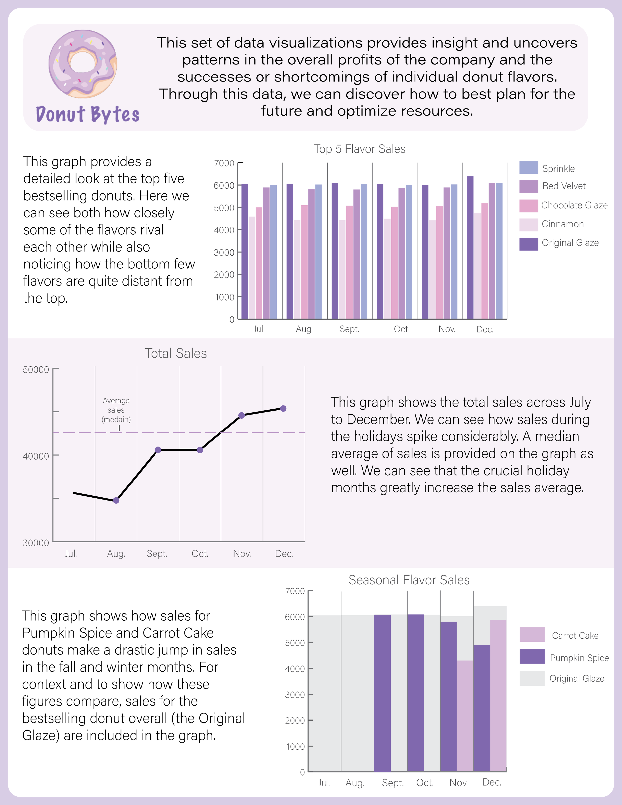
This artifact was created to visualize the data of Donut Bytes sales and how different donut varieties compare to one another. The audience for this design is managers of the stores and administration within the company. It was important that this design made it very easy for viewers to gain insight on donut sales so that they may draw their own conclusions and identify specific information.
The goal for this design was to accurately communicate the data with an on-brand aesthetic. Part of achieving that goal was paying special attention to contrast. The brand colors included a variety of purples. Selecting colors that aligned with the brand, but also had adequate contrast was something I considered carefully. It was also crucial to pay attention to white space and proximity in this design. There was a lot of information and details that needed to fit in a small area, so making sure the design had adequate whitespace and elements were spaced appropriately was key.