

Make it stand out
Cards & Invitations

Happy New Year Card-Metromoheim Museum
This greeting card was created for Metromoheim donors. The card was kept friendly, but also clean and professional. I injected more personality into this design using contrasting typefaces while still letting the image be the star of the show. The design is simple, but aesthetically pleasing and efficient in delivering the message.

Family Christmas Card
This project was created last year for my family’s Christmas card. I was heavily inspired by vintage 50’s and 60’s design which is evident in my use of stars and the boomerang shape. I freehanded all the typography in this project which allowed me to match the retro feel and get more creative with overlapping and combining letters.
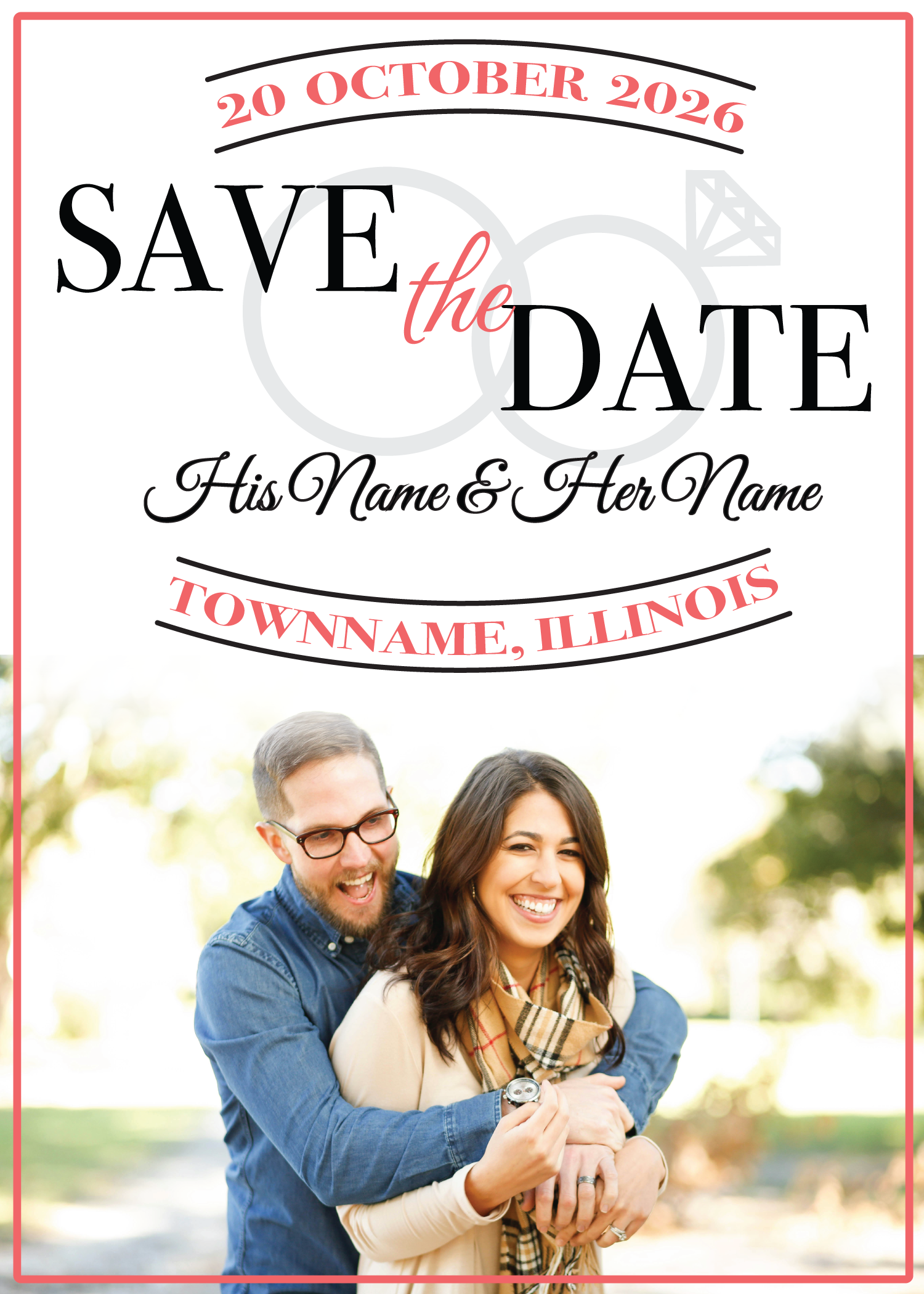
Save the Date
This Save the Date was created for clients who wanted a classic look with their wedding colors—coral and white—incorporated. They also wanted to include their engagement photo. To create a classic look, I kept the layout simple and used arched text to create visual interest without adding unnecessary details. I chose contrasting typefaces that evoked that same classic look and added a romantic feel. The clients and I both agreed that the design needed something extra, so I added a subtle illustration of the wedding bands in the background.

Wedding Reception Invitation
This couple had a very clear idea of what elements they wanted included in their invitation. They asked for a red and pink theme with illustrations of a disco ball and champagne flutes. They also asked for a hand-written, hand-drawn look. This design will only be used digitally, so I added a textured background to simulate paper and soften the overall look.